In anticipation of the release of Phoenix Extravagant by Yoon Ha Lee on October 15th, we spoke to designer Dominic Forbes and illustrator Ronan Le Fur (DoFresh) about the process of creating this outstanding cover.
First let’s hear from designer Dominic Forbes:
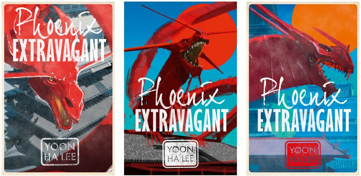
The starting point for designing the cover of Phoenix Extravagant was the short synopsis provided by Yoon Ha Lee’s editor, David Moore, when he commissioned me. I don’t think the book had been written at that early stage so there wasn’t anything for me to read, but there was plenty to go on. An alternate timeline set in Japanese occupied Korea in the early 20th Century, with mechanicals powered by pigments, a non-binary artist protagonist, a mechanical dragon and a whole lot more besides! The brief was for a cover that straddled the boundary between sci fi and fantasy with an Asian flavour.
My process for Phoenix Extravagant started with visual research around East Asian painting and graphic design with a focus on military propaganda posters and ink paintings. This allowed me to think about ways of representing both Gyen Jebi the artist and the occupation/empire on the cover. At a very early stage I came up with the idea of mixing typefaces to represent both sides. Phoenix in a dynamic ink brush script, representing Gyen and also giving an Asian feel. Extravagant set in a block sans serif to contrast and give a retro flavour that evokes old military propaganda posters. The narrow characters also allow Extravagant to be set at a decent size as it’s quite a long word.
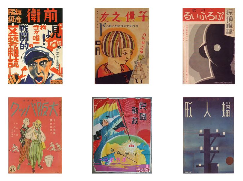
I noticed that a lot of woodblock prints and paintings I was looking at had the artist’s signature in a block/seal, which is called a “chop”. I thought this would be a great idea for Yoon Ha Lee’s author brand as it tied in perfectly with the ideas behind the cover. I had a rubber stamp made especially to get the right texture.

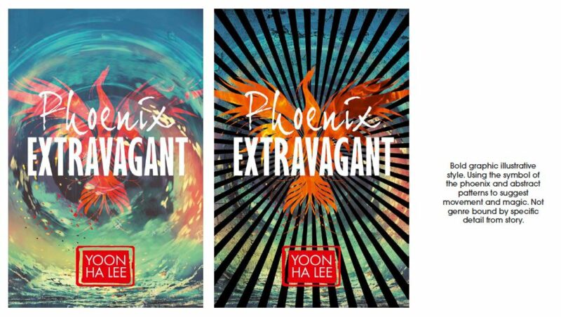
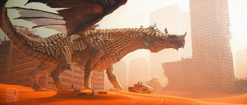
The next stage was to come up with a few rough comps to show David and the team at Rebellion. I identified several different approaches which could work for this book. An epic fantasy look, perhaps with a Korean magical artefact as an icon. A bold graphic style with a phoenix emblem and my favourite, commissioning an illustrator to do an amazing painting of the dragon. I found DoFresh on Artstation (which is a go to when looking for SF and Fantasy artists) and particularly liked the way he’d combined a dinosaur with armour as well as his mech/robots in general so put him forward as a potential illustrator.
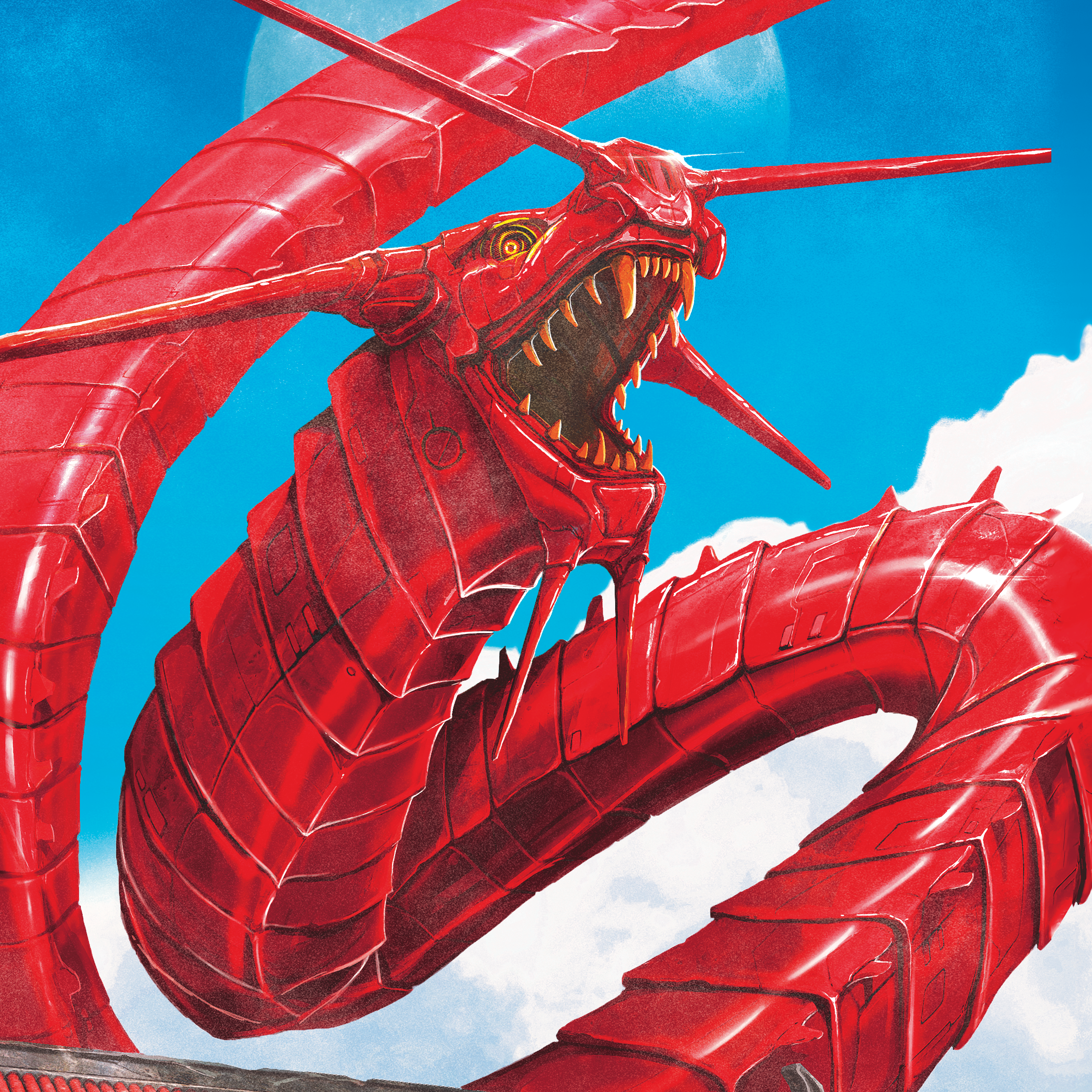
David and the team really liked the commissioned illustration route too so the next step was to brief DoFresh. I tend to keep my art direction quite straightforward when working with artists as I want their imagination to shine through. My brief was pretty much, “We’d really like a brightly coloured, painted, robot dragon on the book cover. Think Eastern dragon rather than Western in terms of design.” With some further information about the story and the design direction for the typography I’d established from my research.
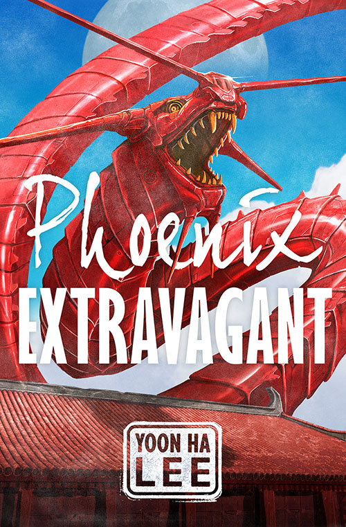
When the sketches came through I dropped them into rough cover layouts. We all really liked the sinuous dragon rearing up above the building so picked that one to develop. There were a few rounds of finessing the art until we got to the finished painting. I added a very subtle screenprint texture to the illustration just to add the feel that it could be a poster.
And now from illustrator Ronan Le Fur:
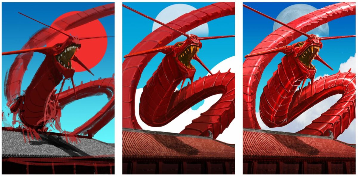
To start I had access to a rather comprehensive summary, in order to get the overall storyline and mood.
As for the process, the editor had some specs for this particular cover: it had to depict a massive red metal dragon. For the rest, I was free to experiment and make proposals. I therefore provided several drafts in order for the clients to pick a composition they would like. The sketches were all digital. They are very basic 3D scenes made in 3Ds Max, followed by a phase of quick paintover made in Adobe Photoshop. This mix of 3D and 2D is a method which enables to create quick iterations and allow to try new approaches. Once one of these rough versions was approved, I then started to refine and polish the image until final approval. It usually takes a few days, with back and forth exchanges. The main inspiration here was propaganda art, with simple shapes and vivid colors.
Dominic Forbes is a book cover designer with many years experience. He worked in-house at HarperCollins until 2018 designing across the adult list with responsibility for overseeing the HarperVoyager fantasy and science fiction imprint. He’s now freelance and clients include Rebellion, Faber, Orion, Transworld, Bonnier and John Blake. FInd out more at www.dominicforbes.co.uk or on Instagram @domforbes.
Ronan Le Fur, a.k.a Dofresh is a freelance artist based in France. He has now more than 15 years of experience in the field of CG imagery and illustration. You can find most of his work on his Artstation portfolio: www.artstation.com/dofresh.
Phoenix Extravagant by Yoon Ha Lee is out in eBook and hardback 15th October 2020.